Wednesday, June 18, 2014

A Quick Character Sketch


Taking a quick pencil sketch and turning it into a quick, rough digital study.
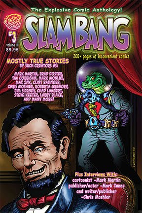
Planning several comic stories involving this fellow, a rather nasty crocodilian lizard alien originally seen in my SLAM BANG cover art here and here.

I have greater plans in store for this one!
More soon...

CLASSIC COMICS REIMAGINED - Crazy Comic Book Revisions - Part 3


CRAZY COMIC BOOK REVISIONS - Part 3

-click to enlarge-


It says "Part 3" up there, but I have a lot of these.

I love classic comics and when I see something that strikes me the right way, I re-imagine it with different words, or perhaps different art. It is just a way I like to amuse myself, 
and if it amuses you too, then even better!

I utilized the original artwork and rewrote the dialogue and recolored the panels.

I have done a lot of these, but this is just the 3rd one I have posted here.
It is a panel from a Golden Age comic book by Harvey called RACE FOR THE MOON #3
Well, technically it's a Silver Age comic, published in 1958. The story is entitled "THE LONG LONG YEARS" and it features artwork by the dream team of Jack Kirby and Al Williamson
The story may have been written by Kirby too.

Here are the actual panels as they appeared originally in 1958.
"THE LONG LONG YEARS" by Jack Kirby and Al Williamson

If you love classic comics and want to see the actual entire story, then click here and visit the best Golden Age comics blog on the internet, PAPPY'S GOLDEN AGE BLOGZINE. Nobody shares their comics collection like Pappy! He has lots of comics and scans to enjoy!

If you like the humorous re-imagining of classic comics (and even if you don't) 
I will be posting more of these Crazy Comic Book Revisions here in days to come, 
because I find them amusing and fun to create!

If you haven't seen them, click these links for 
CRAZY COMIC BOOK REVISIONS 
and 

Thursday, June 12, 2014

Inking and coloring unpublished Jack Kirby cover art - Part 2

-click to enlarge-


I finally found a few minutes to get back to a personal project that was both a joy and a challenge.
A month or so ago I posted this explaining how I came across this unpublished Jack Kirby cover from the proposed FOXHOLE #1 (1954). To see the original post click here

It was a joy in that it was art from comics legend Jack Kirby. I mean, what comic fan wouldn't want to be associated with the "King"?

It was a challenge for several reasons. One reason, the art as I received it from the website was only 72 dpi and not particularly large in size. I would have preferred 300 dpi and then I could reduce as needed without losing details. Having to enlarge 72 dpi  to ink doesn't make it easier.

Another challenge was that Kirby pencil layout was relatively rough, that is, not excessively detailed in any way, and rather vague in certain spots. Without the benefit of being able to ask Mr. Kirby what he originally intended for these unclear areas necessitated  some creative interpretation, as well as attempted trans-time warp psychic thought exchange. Yet, try as I might, I just couldn't read Jack Kirby's mind, after all. 

What I wanted to achieve was to be as true to Kirby's lines as possible, to bring forth that which he originally envisioned as best as I could, without changing anything, as much as I might feel like it.

I finished inking it several weeks ago and put it aside until I felt like returning to add color. I had intended to add flourish lines and details to the inks, but I determined that the simple bold lines would suffice, as I didn't want to risk f@*#ing it up accidentally by adding too much. As I looked at the inked page I noticed one thing: the left side of the image seemed to be missing something.
inked page before alterations

This was a depiction of a beach landing, yet the only craft visible was the lone landing craft (with ship behind it). Where were the other ships? These guys couldn't accomplish much success  alone. So after looking at a similar Kirby cover done about 10 years after this one, I saw what I needed to do.
SGT. FURY #3, 1963 - cover by Jack Kirby (inked by Steve Ditko)

Like Kirby did in this SGT. FURY cover, I needed to add at least a couple of battleships to that empty sea. Also, I re-checked Kirby's pencils and noticed I had omitted  a couple of shots of the strafing gunfire beyond the prone soldiers legs. So, I added that in as well. Now, it was ready to color.

I feel it turned out pretty good. I'm pleased with it, for what it is.
Here again is the original Jack Kirby rough pencil cover art, and my subsequent inks and then colors on top of it.

Click images to enlarge.

Jack Kirby unpublished cover art for Foxhole #1, 1954.


My inks over Jack Kirby


Inked and colored


__________________________________________


A closer look at some details:


Inked page before alterations - This area needed something...


With added battleships, and added gunfire, the scene became more balanced design-wise.


Kirby's main character - his face says, "What am I doing here?!"


Kirby soldier #2 - "Look out! Get down!"


Kirby soldier #3 - too late, the enemy shelling has done it's dirty work, and this soldier has made the ultimate sacrifice.


This "Day At The Beach" is no fun at all - dead soldiers cover the shoreline.


Sunday, June 8, 2014

YOU WILL ENJOY THIS COMIC!

-click to enlarge-

Still putting color on my old black and white comic art while working on new material. 
Panel from SLAM BANG 2.

But, soon, you will enjoy my new comic!
You will, and that's even if Alien Fa-Ree-Mun didn't command it!
Coming soon, more on that to come here in the near future.

Saint Obama

-click to enlarge-

I've been putting color to many earlier black and white works. 
One of them is this satirical political portrait of President Barack Obama.
Entitled "SAINT OBAMA", it pictures our current President, a unique individual who apparently never does anything wrong, is smarter than most of us poor yokels, and even though he seems to be surrounded by incompetence, anything that ever goes wrong is never his responsibility. Don't ever criticize him or his policies, or you may be labeled as a racist in the next wave of administration propaganda. 

Our glorious leader floats high above the mediocre populace and as his wondrous head breaks through the top of the clouds, his rapidly tarnishing halo magically appears and a chorus of angels begin to sing, held aloft by baling wire and duct tape. So bow down and shut up, and realize he knows better than you what you need. One day you may understand, but probably not. We're just not as smart as him, and we never will be, but it's okay, he's resigned himself to that fact. Now get in step!


Saturday, June 7, 2014

"KREEE-GAAHH!" Revisited


Just slappin' a little color on a panel taken from my story "A Message From The Editor/Publisher Allen Freeman" from SLAM BANG #2. Originally done in black and white, This humorous story shows publisher Allen Freeman transform and reveal himself as Alien Fa-Ree-Mun, as he revels in his plan to take over the world. I'm working on coloring my previous B&W stories to include with new stories in upcoming comics.


original page SLAM BANG #2

Friday, June 6, 2014

Throwing a little color on Corben


I've been padding my portfolio and honing all my various skills. One of the things i enjoy lately is coloring comic art. This can be done nowadays by almost anyone with a computer, but there are always varying levels of competency, and those who do it well take their work seriously. The professional colorists nowadays are true artists that, when using their tools correctly, add additional degrees of power and subtlety to the works they color. When done with skill, the storytelling is enhanced almost without the reader knowing it. When done wrong, it is at best a distraction, and at worst absolutely off-putting.

So, just for my own amusement, I'll take some awesome black and white comic art by an artist I admire, and I'll put color to it. Sometimes I'll go for realism, sometimes I'll go for symbolism, sometimes I'll just go crazy with expression and see what happens. Just a learning tool.

The panel here is from a Richard Corben story called HORRIBLE HARVEY'S HOUSE, and features many panels of a voluptuous nude woman. What better story to look at for long periods of time, I ask you?

So here is a panel from the story, before and after color, for my own fun and recreation.

Isn't Corben an incredible artist? I agree.