Friday, April 23, 2010

Thursday, April 8, 2010

PEABODY Comic Strip


I'll eventually get back to posting my early comic strip dailies for NELSON'S NEIGHBORHOOD, but until then, here is a spin-off comic strip idea. PEABODY was a character originally in NELSON's. He is designed with simplicity, and there are probably hundreds of other similar looking characters out there. When I designed him, there weren't any characters that looked like this that I know of. He has a simple oval head and blank oval 'Little Orphan Annie' type eyes. His mouth disappears if not talking, and perhaps even when he does talk. This one is also from the good old 80's ( I did replace my original hand lettering with a cleaner digital font), that's real zip-a-tone, and just look at that tiny television! One day soon I'll update these strips/characters, and repackage them somehow.

Wednesday, April 7, 2010

KREEE-GAAHH!!


A panel taken from one of my humorous comic stories.
(Soon to be featured in my eventual self-published/independant comics!)
Keep on checking in here for future updates on when they will be available!

KREEE-GAAHH!!!!!

Tuesday, April 6, 2010

LOGO DESIGN


Here is my deceptively simple (yet hopefully powerful) logo design featuring my initials, incorporating the three basic colors necessary for typical 4-color reproduction ( yellow, magenta, and cyan, with the 4th color being black, of course). Created in '97-'98 with Adobe Illustrator.

Monday, April 5, 2010

A SHORT STORY EXCERPT - "CHILD'S PREY"


Here's a magazine style page design, short story excerpt and digital illustration I did just to have more stuff in my portfolio while shopping my work around in the 90's.

I'll back up a bit. Right around the time of my airbrush trials I started work doing paste-up and layout work for a local advertising agency, eventually being allowed more and more freedom to do illustrations, page designs and basically everything on the artistic end. Within a year I was the Art Director, and as such I was being allowed to write ad copy and help create nearly everything that came through our doors, side by side with the president of the agency. It was a fairly small agency, yet we did have a few big clients. One client I remember was Toshiba, whose ads we created won a couple of small awards. I lost practiaclly all my tear sheets/samples from this era when a flood in my apartment ruined alot of my saved work, unfortunately, so I no longer have that available to show you.

Fast forward about 15 years, when I was trying to put together my portfolio, minus all my previous samples. I needed to create new samples to show off my abilities, and this is one of those. It features a short story excerpt that I wrote (using my pen name, Gabriel Argus), and a digitally enhanced illustration, but really the main purpose of this piece was to highlight my skill and understanding at page layout and design. The story is a bit gorey, a science fiction/horror tale in the Stephen King vein, so be warned.

Sunday, April 4, 2010

JIMI HENDRIX PORTRAIT AND POSTER


My first attempt at using an airbrush...and my last.

This Jimi Hendrix portrait was actually one of two works I created with my airbrush waaaay back in the early 80's. Back when airbrushed artwork was all the rage on vans, automobiles, and yes, even in illustrations and magazine advertisements. Back then I was very young and very broke, yet I managed to save some money here and there, enough to buy every book I could find about airbrush art, and more importantly, an airbrush.

The art supply store had several to choose from. So many different styles and varieties, it was really hard to decide which one was the best one for me. Fortunately(sarcastic voice), my extremely limited budget made my choices a little simpler. Besides the actual airbrush itself, the most important piece of accompanying equipment was the air compressor. Artists who could afford it would purchase a large compressor that would fill an airtank, and then they could run their airbrush with the tank of compressed air. This was the best option at the time. Well, for starving artists on a tight budget, the cheap alternative was a small, noisy compressor that pulsed like a mechanical heart, pumping air instead of blood. It made an incredibly loud noise  --  "T'pocketa-pocketa-pocketa-pocketa..."  -- yeah, just like that.

So I spent all my money on the airbrush, compressor, and of course the special inks, paints, thinners, friskets, etc...
I was so excited to start creating all the fantastic images that were bouncing around in my imagination. That excitement died every time I attempted to use the cheap equipment I apparently had purchased. The most read section of my airbrush books was the trouble-shooting pages. Every time I used the airbrush it would invariably clog, sputter, splatter, and/or spray in unintended ways that ultimately destroyed every artwork I attempted. Airbrushes have several intricate working parts, and it is quite possible I had a faulty one somewhere in mine. Another contributing factor to the problem could have been the compressor itself, depending on which trouble-shooting guide I was reading at the time. Also, depending on the medium used, the ink/colors may have been a factor, even though I took great care to mix or use the thinnest, unclogging-est mixtures I could. Nevertheless, it seemed nothing I had any control over would ever change the end result: clogging and splattering.

After several weeks, I finally packed up my airbrush and supplies and buried them in my closet, never to be used again. It was pretty disheartening, especially after spending what little money I had on it all. If I'd  had the funds, I would have purchased a different airbrush and tried again, so at least I would know if the airbrush itself was faulty. That wasn't to be, instead I just had to let go of my dream of being a great airbrush artist, and utilize the tools that I could still afford.

The only two pieces that were salvageable from this time were a picture I made of a 'light-cycle' from the movie TRON, and this portrait of Hendrix. Let me rephrase that, barely salvageable. As the airbrush began to sputter and splatter, I stopped working, but luckily the image had acheived enough of the effect to be usable...barely.

I would use the portrait many years later for a series of poster images I wanted to do featuring famous dead rock stars. I chose the big three, Morrison, Joplin, and Hendrix. All were to be black and white with a tiny touch of color. Hendrix' signature song was 'Purple Haze', therefore a purple butterfly was used to symbolize his spirit, which continues to live on, in a way. Also, there was something really eerie and powerful about having Hendrix' ghostly white face emerging from a sea of surrounding blackness, though that design was altered in favor of this one. Another high contrast image of Jimi burning his guitar at Monterey was drawn and used as well.


Friday, April 2, 2010

A SNEAK PEEK AT MY LATEST FUNNY COMIC STORY


I love humorous comics like the older versions of MAD, so lately that's the kind of stuff I have been drawing. Some of my favorite artists have the ability to draw in a variety of styles, from realistic to abstract to cartoony. Some examples would be Wallace Wood, who excelled at serious comic art as well as hilarious cartoon art. A more modern example is William Wray, who has done serious comic book work, is a magnificent serious painter, and can draw some of the most outlandish and funniest cartoons (you may remember some of his gorgeous and creative work from the Ren and Stimpy cartoons).

I'm not putting myself in that same class, but that is my goal, to be diverse enough to handle any artistic challenge that may come my way.

Anyway, lately I have been changing up my 'serious' style (which I will reveal here in time) in favor of a more fluid, cartoony style. In a serious comic, like BATMAN, for instance, the characters have GOT to be recognizable from panel to panel, and of course a degree of realism is required throughout the story. In animated cartoons, however, characters faces can stretch like rubber, and can change their looks drastically at the whim of the creator.  I am looking to bring that type of cartoony effect to my comic story art, as shown here.

Fan-Atic Press publisher Allen Freeman asked me to draw the story for some real-life experiences he had in various restaurants throughout the last several years, and I said "Sure." True to form, I waited until practically the last day to start putting it all together in earnest. I spent about three days straight digging through my original sketches and layouts, re-drawing every single one, and finally ending up with the 4-page story just in time for the publication deadline. Then I slept for 15 hours straight.

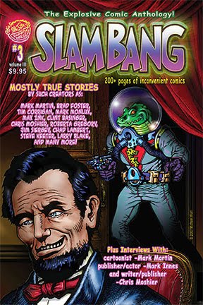
The story will appear in the latest issue of SLAM BANG COMICS (#5), published by Fan-Atic Press. As with all my work for them, I plan on re-using it/re-publishing it later in my own comic publications eventually. I plan to offer these incredible and excellent Michael Wurl comics here soon for everyone who is interested in some of the greatest comics that nobody has ever seen. More on that story as it developes...

Shown here is a sneak peek at the story, an example of my cartoony style. I was fairly happy with the results, but it isn't as good as it should have been if I had spent more time working on it.