

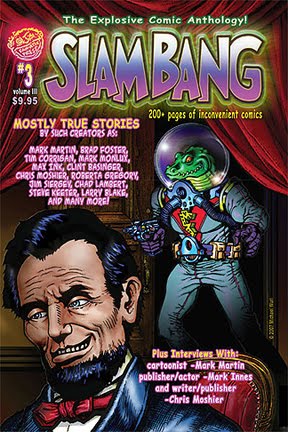
Here is my deceptively simple (yet hopefully powerful) logo design featuring my initials, incorporating the three basic colors necessary for typical 4-color reproduction ( yellow, magenta, and cyan, with the 4th color being black, of course). Created in '97-'98 with Adobe Illustrator.


i really like the flip-ability of this logo. i mean rotate-ability. i'm pretty sure that's a word.
ReplyDeleteYour parents definitely blessed you with a perfectly palatable palindrome~!
ReplyDeleteI would like the logo better if it was just one MEW instead of the repetition. One MEW is more simple-stupid dynamic like Captain Marvel's thunderbolt. I think it loses power by multiplying.
KW,
ReplyDeleteIf it isn't a word, it is now! Thanks!
Jamie-cuss,
Ha! That they did.
I believe you are correct about a single set instead of repeating it. When I made this I was actually trying to create something striking while using the 3 colors...it was kind of stuck in my head to make three (actually 4). But in hindsight, you have a great point. KISS should be a KIRS...that is, 'keep it simple, stupid' should actually be 'keep it really simple'. I totally agree that the best designs are the simplest. They draw the eye, and the more clutter, the more distracting(whether a typeface, logo, or comic splash panel, cover, or illo, 'simple = power', therefore 'simpler = more powerful').
Boy, I didn't keep my reply simple, did I?
Thanks for the constructive commentary!
Hi!!!! thanks for sharing. Its very nice. And one more you need a Logo design
ReplyDelete