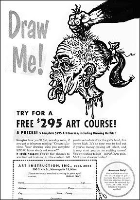
Here's a magazine style page design, short story excerpt and digital illustration I did just to have more stuff in my portfolio while shopping my work around in the 90's.
I'll back up a bit. Right around the time of my airbrush trials I started work doing paste-up and layout work for a local advertising agency, eventually being allowed more and more freedom to do illustrations, page designs and basically everything on the artistic end. Within a year I was the Art Director, and as such I was being allowed to write ad copy and help create nearly everything that came through our doors, side by side with the president of the agency. It was a fairly small agency, yet we did have a few big clients. One client I remember was Toshiba, whose ads we created won a couple of small awards. I lost practiaclly all my tear sheets/samples from this era when a flood in my apartment ruined alot of my saved work, unfortunately, so I no longer have that available to show you.
Fast forward about 15 years, when I was trying to put together my portfolio, minus all my previous samples. I needed to create new samples to show off my abilities, and this is one of those. It features a short story excerpt that I wrote (using my pen name, Gabriel Argus), and a digitally enhanced illustration, but really the main purpose of this piece was to highlight my skill and understanding at page layout and design. The story is a bit gorey, a science fiction/horror tale in the Stephen King vein, so be warned.


nice evil drawing, and the story is pretty great too
ReplyDeleteWhat? I can't hear you, I have a screwdriver in my ear...
ReplyDeleteThanks, KW!
Very nice post. I just stumbled upon your blog and wanted to say that I have really enjoyed browsing your blog posts.
ReplyDelete