Wednesday, March 31, 2010

SLAM BANG STARVING ARTIST FUND - Fake Ad Parody


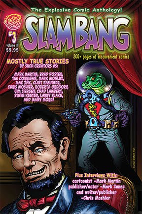
I've been involved with FAN-ATIC PRESS and SLAM BANG COMICS here and there since 2006. Publisher/artist Allen Freeman and I have very similar senses of humor, in that we both love the old MAD magazine parodies.
This is an ad he came up with and wanted me to do the art. The first draft had Sally Struthers begging on behalf of the starving artists. I sent Allen a sketch of Sally Struthers clutching two starving artists close to her bosom. One artist was being choked because he was being held too tightly, while the other artist felt quite comfortable being squished into Sally's breast. Allen didn't care for my Sally Struthers image, as he thought I was playing it TOO wacky. He decided he wanted a more low-key sell.


So we changed Sally to that bald headed, white bearded guy, from the commercials that played incessantly a few years ago. He is nameless, just a spokesman I guess. At least, I do not know who he is. So I drew a picture of him from memory, as I couldn't find a reference picture. For the starving artists, I found an actual photo of some poor starving children from one of those ads, and transformed them into sad, pathetic looking artists.


My first version of the white-bearded old guy was way too mean looking. He looked like he was about to kill...

...so I made a slightly happier version.
Actually, I was only supposed to pencil this and Allen was going to ink it, but he ran out of time. He was assembling the comic for publication and he told me he was just going to run it with just my rough pencil art! I said "No way, Jose!" and I spent the next few hours finishing my art! As I was preparing to send him the finished art, I asked him one last question about the picture of the artists.

"Do you want them like this, or with flies all over them?"

"With flies, please!"

So I put flies all over their pathetic faces, making them even more pathetic.

____________________________________

The ad ran in SLAM BANG COMICS #2 (Vol. III) in 2006-7.


The irony of it all is, right now I really am a starving artist, trying to find paying work where ever I can find it!


PLEASE GIVE, WON'T YOU?


I really am hungry... cough cough...and my cardboard box is starting to fall apart from the rain...

Friday, March 26, 2010

The Creation Of DR. WERTHAM P. FREDRICS


For the faithful few who frequent my humble little arty blog here,
most of you have likely seen my twisted take on the infamous Dr. Fredric Wertham, the psychologist who helped to nearly destroy the comic book industry in the 1950's.

My humorous take on him, Dr. Wertham P. Fredrics, is a much more (hopefully) loveable character than the real Wertham could ever hope to be. More of a cross between your Grandpa and Ludwig Von Drake, Dr. Wetham P. Fredrics has only one on-going theme, one solitary purpose for existing, and that is to convey the 'facts' as he has irrevocably concluded long ago,
that "Comics are SCHMUT!"

I thought it might be interesting to you to see my creative process.

Every comic story, image, or illustration has to start somewhere. Some artists are quite skilled at transferring their creative ideas from their 'noodle', or brain, to the sheet of paper in front of them. In my younger days I took great care in making my layouts very detailed, indeed some talented souls are quite adept at creating rough drafts that are practically finished works in themselves.

I lean very far the other way at this point in my life. My rough sketches are without a doubt some of the roughest you may ever chance to glance upon. Someone with no idea of my thought /work process may look at my rough sketches and have no idea what is in my mind. Only I can decipher these terrible scribbles I call my rough drafts, and I alone can bring forth the image that existed in my head by using these 'roughs' as a reference.

This sketch in fact may be less rough than my usual, but it is still 'purty durn' rough! Below is my original rough idea for Dr. Wertham Fredrics, and the finished line art that emerged bears but little resemblance to the seed that I originally planted with a few scratchy pen lines.

(I must also point out that if my doctor bears any physical resemblance to the actual Wertham, that is merely a happy coincidence, as I did not base my drawing on his true likeness, but rather on the image in my head)

I am currently working on a humorous comic book featuring Dr. Wertham P. Fredrics as the main character, in which the good doctor, whenever he exposes himself to the 'schmut' of any comic book (by merely looking at it's contents), transforms into the hulking brute known as Captain Culture, who promptly goes about smashing in the faces of anyone who enjoys reading comic books.
Brute force and ignorance, indeed.


First, here is my original rough sketch of my idea...


The next step was drawing the final line art...


...and finally, here is the colored version.


Thursday, March 25, 2010

NELSON'S NEIGHBORHOOD Daily Comic Strip # 4


Hello again!

I'm back with another NELSON'S NEIGHBORHOOD daily strip. Sorry it took so long between posts, but it's hard to type when you are wearing one of these straight-jacket thingies.

This is strip # 4 in the daily sequence, and you may or may not notice a slight difference in one or two characters. That is because after I began the strip, I revamped the character's design(s) a little bit. The first three strips are all revised, and this one is my original (I can't locate the revised strip # 4), and the biggest difference is the character of Mr. Nelson (it's been so long since I worked on these, I can't even recall Mr. Nelson's first name at the moment). In the revised versions, you'll notice his hair is simpler, more curvey and less jagged, and his face shape is also more rounded (yet still a rectangle, basically). It is also the first appearance of young Timmy Nelson, their son.


Thursday, March 11, 2010

NELSON'S NEIGHBORHOOD Daily Comic Strip # 3


My very first attempt at a daily comic strip, done in the 1980's, continues with Nelson's Neighborhood # 3.

I cringe a bit when I look at certain things that I would do differently now, like Judy Nelson's face in panel three. Her oval head and butterfly hair-do were distilled to basics in order to make her easy to draw and also make her instantly recognizable, but she sure is fugly sometimes.

Just like real wives. Hey!

I really like the old couple. Maybe I'll do a new strip about them.

The saga continues...


Wednesday, March 10, 2010

NELSON'S NEIGHBORHOOD Daily Comic Strip # 2


In the past 48 hours or so, I have spent less than 8 sleeping, so pardon me if I am groggier than usual.
I have been illustrating a funny (of course!) comic story for my good friend Allen Freeman, who has published several of my works before in his cool line of comics, Fan-Atic Press. I just finished the last page of a four page story that will appear in the upcoming SLAM BANG Comics. Allen is a great artist himself, along with being an independant comic publisher for the past couple of decades. To find out more about the comics, you can find a link on my comics blogs.

I wasn't sure if I was gonna get this post in on time, but here it is. The continuing adventures of the starchy stiff whitebread W.A.S.P.'s known as the Nelsons (and yes, they were meant to be a twisted, updated variation of the too-good-to-be-true Ozzie and Harriet Nelson's).

Here ya go! NELSON'S NEIGHBORHOOD # 2!


Tuesday, March 9, 2010

NELSON'S NEIGHBORHOOD Daily Comic Strip # 1


This was my first serious attempt at a syndicated comic strip, done many years ago. I'm talking late1980's.
That's before personal computers, kids!
Everything was done old school, hand drawn, hand lettered, zip-a-tone hand applied. If I were to redo it today, all of those things would be done easier, faster and much neater looking with the aid of our little friend, the computer.

This was a family friendly strip designed to run in syndication in your local newspaper. Unfortunately, at the time, there were no syndicates wise enough to take a chance on it, so it ended up gathering dust in my stack of dusty art.  I big on not wasting anything, so this will eventually get re-tooled and updated in some form.

One of the fun things about creating a strip like this is thinking up and designing characters. I went through a couple of different stages of developement, and a little trial and error, until I found character designs that seemed both easy to draw on a daily basis and hopefully visually appealing. The premise for the strip is this: a young married couple with one child, a son, move into a new home in a new neighborhood in order for the husband to begin his new career at a fancy advertising agency. From day one, all is not what they had expected to find. Wackiness ensues. The strip starts out slow and builds, at least that was my intention.

One of my many inspirations as a cartoonist was Walt Kelly's POGO, because he manged to create intricate ongoing storylines while still delivering daily strips that were hilarious. I'm not saying I achieved that, but that was and is my goal in every comic strip I have ever done. As each successive strip airs, it is linked to, though not dependant on, the previous one.


Monday, March 8, 2010

THE ART OF MICHAEL WURL


Hey, That's me!

The artist, that is, not the guy in the picture. A couple of people have seen this and wondered, "Does he only have one eye?"

Well, if I did, that would be a good excuse for some of my not-so-good art, but, no, the person pictured here was originally supposed to be Nick Fury, from Marvel Comics. I have been a rabid Steranko follower since I first discovered his art on Nick Fury, Agent Of S.H.I.E.L.D. in the late 60's.

The model for this piece was actually the bass player in my old band Vertigo, Paul Browne. I had several old photos I had had taken of the band with black and white film, and I needed a model for a story I was going to draw. I never drew the complete story, but I love the old black and white noir films of the 40's and 50's, and decided to create this image. It was originally going to be the splash page main image at the beginning of the story, where you don't see the character until he lights a match or a lighter in a darkened alley. I wanted a dramatic, high contrast stylized look. I was kind of rushed when I did this, and one day I hope to redo it. I am not really happy with the hand, but the rest is working alright for me.

Sunday, March 7, 2010

DING! TWO POINTS! RIGHT BETWEEN THE OLD GOALPOSTS!!

Hello to my three paid followers!

Welcome to my spankin' new bloog where I plan to feature some of the most awesome art you've ever seen!

Until then, I will be posting my own art, instead!

I have been kinda busy lately, what with all my stalking, the washing off of the blood, and posting bail, and what-not, so I'll be brief...

I have several art projects I am working on, and one of them is artwork for my soon to be self-published comic books. Since I was blessed with a warped sense of humor, many of these projects deal with humorous topics. This image, obviously, is for a very serious comic book cover however.

Just kidding.

This is an element for the cover of a humor comic to be named later. There are more things that will be going on in the cover, but I like to focus on one element at a time. The image below is the heart of the proposed cover.

Quite often I work from live models, like the great Alex Raymond and others. In this case, I used my neighbor Fred and his son, Tommy as my models. I suppose I could have just photographed them and worked from the photo, but I like to work like the old, Italian masters used to.

On a sad side note, my neighbor Fred is still in the hospital. Hope you feel better soon, Fred.


(click to enlarge)
or
(kick to enlarge)